Deep Dive into Web Performance: Mastering LCP Optimization for SEO Success
Web performance and SEO in particular can be a complex topic that can take some time and effort to master. Apart from some general tips like reducing page weight, compressing images, etc., sooner or later you may need to dig into this.

Who is this article for: If you're just curious or think you have performance issues (in which case we need hard numbers first - real user data is best here.Google, hosting companies and online services provide tools known as real user monitoring (RUM) that allow you to collect and view user data such as performance. If you don't collect it you can use for example webpagetest or pagespeed)
LCP breakdown
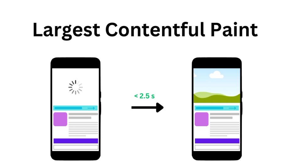
What is it? LCP stands for Largest Contentful Paint; it is one of the Core Web Vitals (CWV) metrics that is used to evaluate the performance of a web page. In short, it is a measure of how quickly you can deliver and show content to users. LCP score directly affects SEO: the better the LCP, the better the SEO. Please do not confuse it with FCP (First Contentful Paint) - the two mean different things: FCP indicates the first appearance of content (not necessarily main content) on the screen and has only one entry, whereas LCP measures until the end of loading (more precisely, before the first user interaction) and can have multiple entries. since larger elements may appear in the viewport while the page is loading, but only the last – the largest element will be taken as the metric value. But sometimes they can point to the same element. Let's see some examples for better understanding. Regardless of special tools, we can extract performance metrics manually right in a browser console during a session.
  new PerformanceObserver((list) => console.log(list.getEntries())).observe({
    type: "paint",
    buffered: true,
  });

  new PerformanceObserver((list) => console.log(list.getEntries())).observe({
    type: "largest-contentful-paint",
    buffered: true,
  });
For example, the FCP and LCP of this web page have the same time. We also only have one entry for LCP. This means that FCP corresponds to LCP.
![]() browser console output
browser console output
But it was an ideal scenario, usually we have a different picture. There are several LCP entries on this web page, none of which correspond to Larger items appearing during loading until the largest one appears, which will be the LCP.
![]() browser console output
browser console output
According to httparchive, a significant number of websites have problems with LCP, so this may be a sign that getting a good score on LCP may not be easy.
![]() the percentage of origins with good LCP score
the percentage of origins with good LCP score
The main reason for this is the LCP complexity: we need to think about content and speed at the same time. Even the default text element isn't necessarily fast, let alone images. What counts as content? – Since this is a user-centric metric we are interested in contentful blocks of information – only visible elements can be candidates for LCP. The contentful element is the largest and most significant piece of content within the user's viewport. This can be an image, a block of text, a video. Speed corresponds to time here – the time it takes to load and display an element to the user. Moving from the last event to the first: before rendering, we need to load a resource for the element - an image or a web font; to load the resource first we need to detect the element and its resource url and before that we need to load the HTML document first. Google defined these stages as follows: now from the first event to the last:
- TTFB is the time to first byte. This is a measure of how quickly your server can send an HTML document to a user upon request,
- Load delay is a measure of the time between the TTFB and the start of loading of the LCP element,
- Load time the time it takes to load resource,
- Render delay time is the time between states when the browser has everything to render your LCP, but has not yet rendered it.
Some details about which element can be an LCP candidate.
LCP has its own specification, according to which it can be image or text. No restrictions for text. An image can be provided by the following tags: <img/>, <video/>, <image/> within a <svg/>, but <svg/> itself can't be an LCP. A CSS pattern will not be treated as LCP, but a background with an image provided in the url() will. For animated images (GIFs) or videos, only the first frame (thumbnail) will be considered as a candidate for LCP. If an image fills the entire viewport, it will not be considered an LCP, but rather a background.
There are some limitations in measuring LCP.
Ways to improve
Should be noted that to improve performance you need to prioritize the resources that are critical to rendering everything in the user's viewport and put everything else aside. It's useful to know the browser's critical rendering path (CRP).
What we will improve is the timings, but we also need to consider both text and images.
We will follow Google's timing model for LCP. The sum of all timings must be less than 2.5 seconds to be considered good. But each part has completely different reasons. Moreover, sometimes when you reduce one part, you simply increase the adjacent part to the same amount, leaving the overall time the same. So to make real improvement you need to improve all timings – each timing should be as short as possible.
TTFB. This performance metric refers to the point at which the user begins receiving data. Therefore, we must send data as soon as possible after user interaction. Each additional step will potentially increase this time. It can sometimes be difficult to improve and this metric deserves its own article, but we can limit ourselves to the following tips:
- avoid redirects – they can impact TTFB because they introduce additional steps in the process of fulfilling a user's request for a web page,
- optimize server response times by using efficient hosting, CDNs, and caching mechanisms.
- if you use server side rendering (SSR) ensure it is fast, switch to static site generation (SSG) if possible, some frameworks support streaming from the server - which allows you to start sending HTML even if it not completely ready.
What is good: 0.8 seconds or less
Load delay. This is the time between TTFB and the start of loading. To start loading, the browser needs to scan (preload scanner) the page to understand what resources it needs to render in order to start loading them. And if you don't give the browser any hint, it will only find those resources when it encounters an img element or text node with a required web font. Sometimes it's a significant portion of the time. To reduce this time, you can add <link/> tags in the <head> for the web font and images that could potentially be LCP.
Let's consider fonts first. For Google fonts it could be something like this
<link rel="preload" href="https://fonts.googleapis.com/css?family=Roboto&display=swap" as="style"crossorigin="anonymous"/>
 <link rel="stylesheet" href="https://fonts.googleapis.com/css?family=Roboto&display=swap"crossorigin="anonymous"/>
Since it's a separate https connection, serving those fonts from your server may be faster.
<link rel="preload" href="/fonts/Roboto/RobotoBold.woff2" as="font" type="font/woff2">
<link rel="stylesheet" href="styles/fonts.css"/>
But I suggest testing both approaches to see which is the fastest in your case.
For images it looks very similar.
<link rel="preload" as="image" href="https://imagecdn.com/some-image.webp">
The background image cannot be preloaded this way but you can embed the image in CSS using the dataURI and then inline styles in the <head/>. So instead of using an image link.
.cool-background {
background: url("image.png");
}
You can insert an encoded image string into the url.
.cool-background {
background: url("data:image/png;base64,iVBORw0KGgoAAAANSUhEUgAAAZAAAABmCAMAAADS3TdOAAACTFBMVEX/////TkIqef8Jzmv/pABmZmZDQ0MAAAD/89z/5+X/7c7d+OvQ9uL/3dpFiP+Ktf+ewv9+5bJra2t0vD36+voMBgGsyv/d3d2kpKT39/dtbW0EAwHEfgJ5eXkjFgPcjgL....")
}
If you are using svg, then instead of using <img/> with a src link to the svg file, you can include the svg in the html. So instead of
<img src="logo.svg" />
You can do something like this
<svg xmlns="http://www.w3.org/2000/svg" width="400" height="400" viewBox="0 0 124 124" fill="none">
<rect width="124" height="124" rx="24" fill="#F97316"/>
<path d="M19.375 36.7818V100.625C19.375 102.834 21.1659 104.625 23.375 104.625H87.2181C90.7818 104.625 92.5664 100.316 90.0466 97.7966L26.2034 33.9534C23.6836 31.4336 19.375 33.2182 19.375 36.7818Z" fill="white"/>
<circle cx="63.2109" cy="37.5391" r="18.1641" fill="black"/>
<rect opacity="0.4" x="81.1328" y="80.7198" width="17.5687" height="17.3876" rx="4" transform="rotate(-45 81.1328 80.7198)" fill="#FDBA74"/>
</svg>
Some general tips:
<link/> can also have fetchpriority attribute with ‘high’, ‘low’, ‘auto’(default) values.
By using this attribute, you can more precisely control resource loading.
Setting it to 'high' means the browser will give it priority over others, setting it to 'low' will reduce the priority of the resource, but the browser can still increase the priority if the browser needs it.
Even though you can use this attribute directly in the <img/> tag, it's better to add it to the head so that the browser can detect it earlier. Additionally, it is not widely supported yet – around 78% global.
<img src="image.jpg" fetchpriority="high">
Note: You can't just mark everything with fetchpriority="high". If everything is "high" priority, then nothing is "high" priority – important resources will be loaded among other resources in a large queue, and this can potentially lead to poor performance.
You also can try to preconnect to the hosting with required resources.
<link rel="preconnect" href="https://fonts.googleapis.com" crossorigin>
To get a feel for the numbers, let's look at an example. I did two tests of the same page on different connections on webpagetest.
![]() network timings
network timings
4G connection: 9000/9000 Kbps, latency 170ms, total connection time 353ms.
![]() network timings
network timings
3G connection: 1600/768 Kbps, latency 300ms, total connection time 647ms. The total connection time should give you an idea of the potential savings when using pre-connection optimization.
chrome.com improved Time To Interactive by almost 1 s by pre-connecting to important origins.
Note: It's important to understand that preconnect directives serve as optimization cues. The browser may not always act upon every directive, and it has the flexibility to adjust its approach, possibly opting for a partial handshake like falling back to DNS lookup alone or combining DNS with TCP for TLS connections
Best case = 0 – everything you need comes with an html document – LCP is a text node or image that is inlined.
Load time. We cannot speed up user connections, so we can only reduce the weight of resources. Here images optimization will work:
- use lossless compression and resize images to reduce their file size without compromising quality (some modern framework can do it at a build step, also there are plenty of online services, CMSs usually have it is own image service),
- use modern image formats like WebP that offer better compression efficiency (Typically the conversion to webp occurs during compression. WebP is widely supported, AVIF has even better compression and is widely supported too),
- use browser caching to store static resources on the user's device, reducing the need to retrieve them on subsequent page loads (Cache-control header),
- use a CDN for static assets to reduce latency and improve content delivery speed,
- show images in different sizes depending on the size of the viewport — responsive images.
Let's talk about the latter in more detail. The main idea here is that you don't have to send a full-size image to a mobile device. Instead, you can specify multiple URLs depending on the viewport.
<img
  srcset="image-small.jpg 480w, image-big.jpg 800w"
  sizes="(max-width: 600px) 480px,800px" src="image-big.jpg" />
In this example, in srcset we list all image links by screen width (first goes image link then space and then width), the "w" here does not mean pixels, but a width descriptor (in short, to get the actual pixels – CSS pixels, the specified width is multiplied by the device pixel ratio (DPR)). In sizes you declare the rules on how images should be applied.
If your image has certain dimensions it is better to build the srcset depending on the pixel ratio.
<img
  srcset="image-small.jpg 1.5x, image-big.jpg 2x"  src="image-big.jpg" />
Here 1.5x and 2x are the device pixel ratios (DPR).
Even though modern frameworks provide us with an API to optimize images, we usually don't have the ability to declare rules based on the device pixel ratio. So to save bandwidth and improve performance, we can use <picture> with multiple sources to limit the image size based on DPR.
<picture>
// here should be rules for lower DPR
<source media="(-webkit-min-device-pixel-ratio: 3) and (-webkit-max-device-pixel-ratio: 3.9)" srcset="https://a.storyblok.com/f/167931/2812x1520/98fdb9db37/2812x1520px-5.jpg/m/427x0/filters:quality(75) 640w, https://a.storyblok.com/f/167931/2812x1520/98fdb9db37/2812x1520px-5.jpg/m/720x0/filters:quality(75) 1080w, https://a.storyblok.com/f/167931/2812x1520/98fdb9db37/2812x1520px-5.jpg/m/1280x0/filters:quality(75) 1920w">
// here should be rules for bigger DPR
<img alt="image" sizes="100vw" srcset="https://a.storyblok.com/f/167931/2812x1520/98fdb9db37/2812x1520px-5.jpg/m/640x0/filters:quality(75) 640w, https://a.storyblok.com/f/167931/2812x1520/98fdb9db37/2812x1520px-5.jpg/m/1920x0/filters:quality(75) 1920w" src="https://a.storyblok.com/f/167931/2812x1520/98fdb9db37/2812x1520px-5.jpg/m/3840x0/filters:quality(75)">
</picture>
The idea here is to show images no higher than 2x. This applies for DPRs above 2x.
Don’t forget to add links in the <head/>.
<link rel="preload" as="image" media="(-webkit-min-device-pixel-ratio: 3) and (-webkit-max-device-pixel-ratio: 3.9)" imagesrcset="https://a.storyblok.com/f/167931/2812x1520/98fdb9db37/2812x1520px-5.jpg/m/427x0/filters:quality(75) 640w, https://a.storyblok.com/f/167931/2812x1520/98fdb9db37/2812x1520px-5.jpg/m/720x0/filters:quality(75) 1080w, https://a.storyblok.com/f/167931/2812x1520/98fdb9db37/2812x1520px-5.jpg/m/1280x0/filters:quality(75) 1920w">
// same for other sources
For fonts, use modern formats like woff2, which are optimized for the web and widely supported.
Render delay. Something is interfering with rendering. Usually can be caused by one of the following: Main thread is busy, Last second DOM change, Blocked by CSS
What it means is that the main thread is busy and doesn't have the resources to actually render. In this case, be sure to download and execute non-essential or third-party JS (our Google Tag Manager perf guide) after loading the main document. Also the main thread may be busy decoding your images. All image decoding occurs on the main thread. Therefore, it is useful to have an idea of the image decoding speed.
Here's a comparison of decoding speeds for different image formats.
There is a "decoding" property for <img/> that has three possible values:
- "sync": decode the image synchronously,
- "async": decode the image asynchronously, allowing other content to be rendered before completion
- "auto": no preference for decoding mode; the browser decides based on what's best for the user. Default values may vary across browsers.
For non-critical images it is better to use asynchronous decoding.
<img src="encoded-image.avig" decoding="async" />
By last second change I mean sudden changes to the DOM or styles that affect the LCP and therefore change the rendering latency. Adding an LCP element to the viewport: Dynamic DOM manipulation using JS or the element was initially hidden by CSS and then shown. In most cases, you can provide a completely finished HTML document, or at least with the main content. Check if you can do this server side/build time.
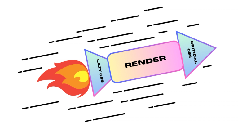
Can be blocked by CSS because stylesheets normally are blocking resources. You could try just inline all the CSS into the <head/> and see if that improves your FCP and LCP metrics. The best option here is to extract your critical CSS, inline it and postpone loads of other styles (a popular solution without a browser and a popular solution that uses a headless browser). Inlining CSS should noticeably improve your performance, especially if loading styles takes longer than loading the LCP - the LCP is ready and waiting for the styles.
Modern browsers can parse and render HTML by chunks. Browsers do not wait till full load to start parsing and rendering the document. This means you will not improve your LCP score by simply reducing overall document weight. Because you need to reduce the number of bytes/work before the LCP element, not after. By placing your LCP element at the top of your HTML document you can potentially decrease LCP timings.
Also should be noted that if the LCP element is not at the very top of the page – LCP elements can be different on different viewports (devices), depending on screen height and width.
Article Recap
In this article, we delved into web page performance, focusing on the intricacies of Largest Contentful Paint optimization.
LCP's complexity arises from balancing content and speed considerations. Identifying contentful blocks within the viewport is crucial for LCP optimization.
Improving LCP involves prioritizing critical resources for rendering and optimizing load timings.
Despite the fact that the article is full of technical details, the topic itself is not fully covered. The article is longer than I expected, and adding more examples to it will only make it less readable. After reading this, you should have an idea of possible ways to improve your website's performance. Don't forget that performance is measurable and you should always run before and after tests to measure the impact of optimization.


